France/ A new logo for the commune of Caudan
The commune of Caudan's previous logo was created in the 1980s. The municipality presented a new, more modern visual identity.
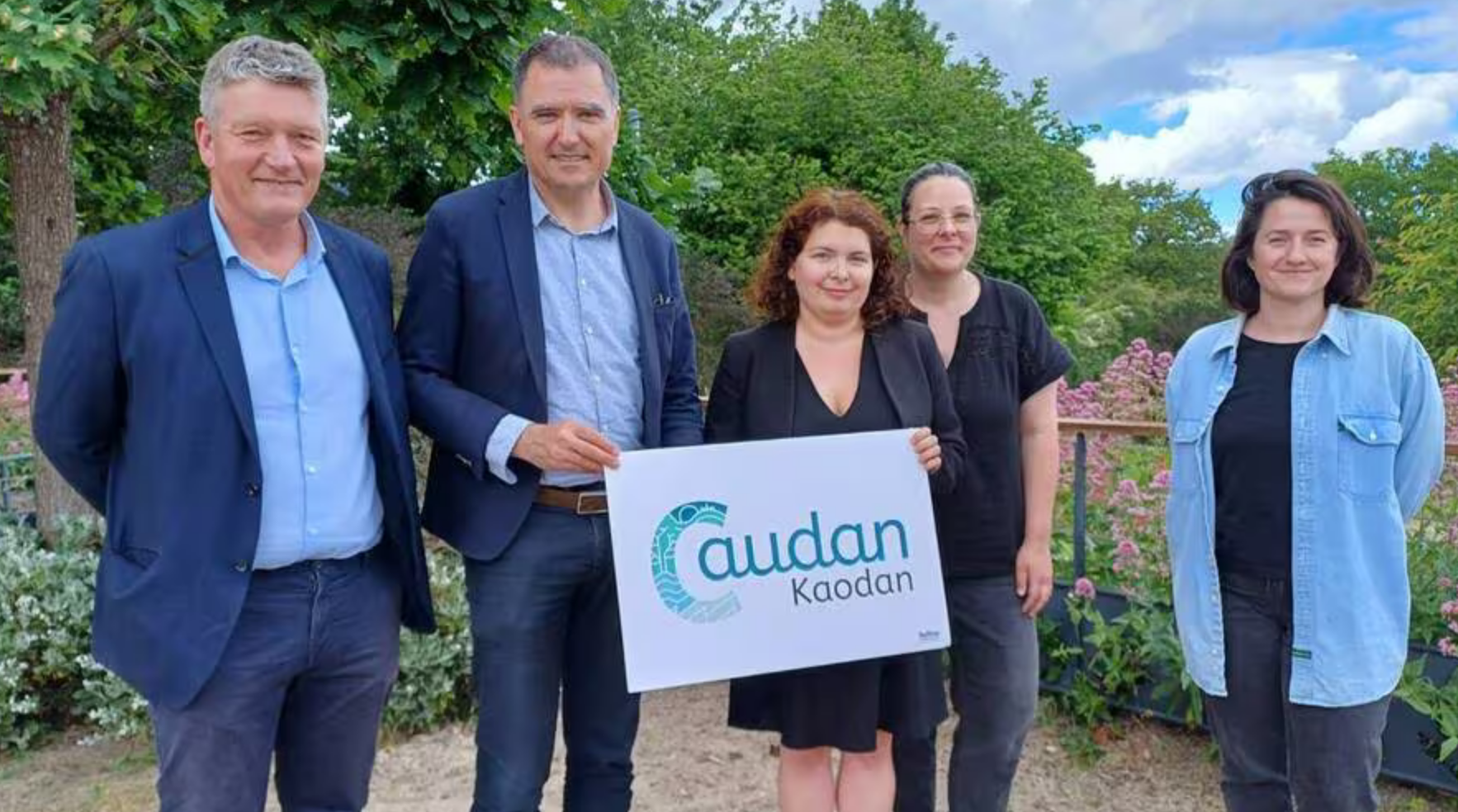
The commune of Caudan(Morbihan) has changed its logo, which is its first signature, present on all the commune's communication media. Created in the 1980s, the previous logo was almost 40 years old. Since then, unlike this logo, the face and image of Caudan have changed radically. With the elected representatives, we wanted to give it a new look, to make it more representative of the commune's dynamism", says Mayor Fabrice Vély.
A nod to the old logo
After setting up a working group during 2022, a questionnaire was circulated to the population at the end of 2022, to gather information on the image Caudanais have of the commune. A local agency, based in Lanester, was chosen to work on the new logo. The new logo is designed to be dynamic, highlighting four elements visible in the letter "C" for Caudan: the town and its town center, nature, the river Scorff, the streams running through the commune and the business parks. A nod to the old logo appears at the top of the "C", in the form of a sun and the church steeple.
A very Breton logo
As nature is very present in Caudan, it was obvious to include it in this logo, with the tree and water as central elements of our environment," adds the mayor. As for the choice of color, the logo comes in a gradation of shades of glaz (blue in Breton) and the presence of the commune's Breton name, Kaodan, definitely confers a Breton identity on the commune.
Source: www.ouest-france.fr/